Perspective - Horizontal Menu

Component Palette Icon:
Description
Horizontal Menu component enables you to build a menu structure by setting up multiple links to different page URLs from the component. The Horizontal Menu occupies a large amount of horizontal space and a comparatively small amount of vertical space. The menu starts with a list of root-level menu items that make up the main display area of the component.
If you have more menu items than will fit the width of the component, arrow buttons appear to enable you to scroll left and right through all menu items. The control can also be disabled as a whole.
Each menu item can be configured with a target that will serve as either a link to a page that should be shown (e.g. “/my-page”), or a link to an external web page (e.g. “http://www.inductiveautomation.com/”). They can also be given a list of child menu items that will show temporarily in a popup as the user is interacting with them. Additionally, menu items can be labeled, disabled, and be given an icon to show to the left of their label.
Properties
Most Properties have binding options. For more information on Bindings, see Types of Bindings in Perspective. This section only documents the Props Category of properties. The other Categories are described on the Perspective Component Properties page.
| Name | Description | Property Type |
|---|---|---|
| items | Configure items representing the main menu items.
| |
| enabled | If true, the component is enabled/active. Default is true. | value: boolean |
| itemStyle | Sets a style for all the items in the component. Full menu of style options is available for text, background, margin and padding, border, shape and miscellaneous. You can also specify a style class. | object |
| style | Sets a style for the entire component. Full menu of style options is available for text, background, margin and padding, border, shape and miscellaneous. You can also specify a style class. | object |
Scripting
See the Perspective - Horizontal Menu Scripting page for the full list of scripting functions available for this component.
Examples
In addition to the examples below, learn more about the Horizontal Menu component on the Navigating with the Horizontal Menu Component page.
Example 1
This example shows a Horizontal Menu with four items. The first item also has two subitems. Each item links to a webpage. Icons are taken from the Material Design icons that can be found here: https://material.io/tools/icons/.

Top Level Properties
| Property | Value |
|---|---|
| props.items.0.enabled | true |
| props.items.0.target | https:// (link to Acme home) |
| props.items.0.icon.path | material/home |
| props.items.0.icon.color | #FF0000 |
| props.items.0.label | Acme Inc. |
| props.items.1.enabled | true |
| props.items.1.target | https:// (link to products) |
| props.items.1.icon | material/flare |
| props.items.1.color | #D97700 |
| props.items.1.label | Products |
| props.items.2.enabled | true |
| props.items.2.target | https:// (link to forum) |
| props.items.2.icon.path | material/forum |
| props.items.2.icon.color | #800080 |
| props.items.2.label | User Forum |
| props.items.3.enabled | true |
| props.items.3.target | https:// (link to help) |
| props.items.3.icon.path | material/help |
| props.items.3.icon.color | #00AC00 |
| props.items.3.label | Help |
| props.style.borderStyle | solid |
| props.style.color | #FF4747 |
| props.style.fontSize | 18px |
| props.style.fontWeight | bold |
| props.style.borderWidth | 1pc |
| props.style.borderColor | #FFCCCC |
Sub Level Properties of Item 0
| Property | Value |
|---|---|
| props.items.0.items.0.target | https:// (link to about) |
| props.items.0.items.0.icon.path | material/info |
| props.items.0.items.0.icon.color | #FF0000 |
| props.items.0.items.0.label | About Us |
| props.items.0.items.0.target | /screen_2 |
| props.items.0.items.0.enabled | true |
| props.items.0.items.1.target | https:// (link to about) |
| props.items.0.items.1.icon.path | material/local_see |
| props.items.0.items.1.icon.color | #FF0000 |
| props.items.0.items.1.label | Map |
| props.items.0.items.1.target | https:// (link to map) |
| props.items.0.items.1.enabled | true |
Example 2
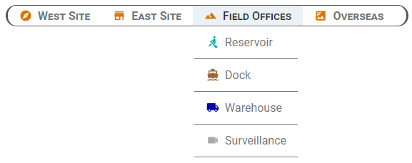
This example shows a Horizontal Menu with four items that are linked to views within the Perspective project. The third item in the list, Field Offices, has four subitems. Each item links to a view for a different field office. Icons are taken from the Material Design icons that can be found here: https://material.io/tools/icons/.
Top Level Properties
| Property | Value |
|---|---|
| props.items.0.enabled | true |
| props.items.0.target | /west |
| props.items.0.icon.path | material/explore |
| props.items.0.icon.color | #D97700 |
| props.items.0.label | West Site |
| props.items.1.enabled | true |
| props.items.1.target | /View_East |
| props.items.1.icon | material/store |
| props.items.1.color | #D97700 |
| props.items.1.label | East Site |
| props.items.2.enabled | true |
| props.items.2.icon.path | material/landscape |
| props.items.2.icon.color | #800080 |
| props.items.2.label | Field Offices |
| props.items.3.enabled | true |
| props.items.3.target | /satellite |
| props.items.3.icon.path | material/satellite |
| props.items.3.icon.color | #00AC00 |
| props.items.3.label | Overseas |
| props.style.borderStyle | solid |
| props.style.fontStyle | normal |
| props.style.fontVariant | small-caps |
| props.style.borderRadius | 16 |
| props.style.borderColor | #555555 |
Sub Level Properties of Item 2
| Property | Value |
|---|---|
| props.items.2.items.0.enabled | true |
| props.items.2.items.0.target | /reservoir |
| props.items.2.items.0.icon.path | material/rowing |
| props.items.2.items.0.icon.color | #00ACAC |
| props.items.2.items.0.label | Reservoir |
| props.items.2.items.1.enabled | true |
| props.items.2.items.1.target | /dock |
| props.items.2.items.1.icon.path | material/directions_boat |
| props.items.2.items.1.icon.color | #9E6635 |
| props.items.2.items.1.label | Dock |
| props.items.2.items.2.enabled | true |
| props.items.2.items.2.target | /warehouse |
| props.items.2.items.2.icon.path | material/local_shipping |
| props.items.2.items.2.icon.color | #0000AC |
| props.items.2.items.2.label | Warehouse |
| props.items.2.items.2.enabled | true |
| props.items.2.items.2.target | /surveillance |
| props.items.2.items.2.icon.path | material/videocam |
| props.items.2.items.2.icon.color | #AAAAAA |
| props.items.2.items.2.label | Warehouse |
Example 3
This example shows a Horizontal Menu with four items.

Top Level Properties
| Property | Value |
|---|---|
| props.items.0.enabled | true |
| props.items.0.icon.path | material/sentiment_very_satisfied |
| props.items.0.icon.color | #D97700 |
| props.items.0.label | Comedy |
| props.items.1.enabled | true |
| props.items.1.icon | material/star |
| props.items.1.label | Drama |
| props.items.2.enabled | true |
| props.items.2.icon.path | material/whatshot |
| props.items.2.label | New Release |
| props.items.3.enabled | true |
| props.items.3.icon.path | material/event_seat |
| props.items.3.label | Home |
| props.items.3.style.backgroundColor | #CCFFFF |
| props.itemStyle.backgroundColor | #FFFF00 |
| props.itemStyle.borderStyle | dashed |
| props.style.borderStyle | solid |
| props.style.borderWidth | 6px |
| props.style.borderColor | #000000 |