Getting Started with Report Charts
Report charts offer many functions and features, including various chart types. The best chart type for you to use depends on your data and how you want to display it. This page uses a Timeseries Chart example to demonstrate the necessary steps for adding a chart to a report.
Creating a Report Chart
One of the most common charts used for historical trending is a Timeseries Chart. The Timeseries Chart plots values against a timestamp X axis.
Adding a chart to a report involves a few steps:
- The chart needs data, so we must create a data source.
- Once a data source exists, we can create the chart and assign the data source.
- Apply any additional chart configuration, such as adding an additional axis.
Now, let's follow these steps to create a Timeseries Chart using Tag History data.
Creating a Data Source
This procedure requires a device connection and a database connection.
- Ignition comes with one internal Tag Provider you can use with the Programmable Device Simulator as a starting point if your Gateway is not currently connected to a PLC. This example assumes your device is named 'generic' and you are using the Generic Program device tags, but any tags can be used.
- The database connection is needed for the historian to store Historical Tag data. This example assumes Tag History has been enabled on the Sine tags.
-
In the Data tab, under Parameters and Data Sources, click the Add
 icon to add a data source. Select Tag Historian Query.
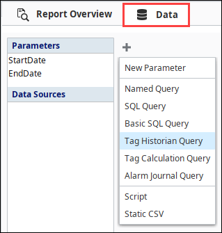
-
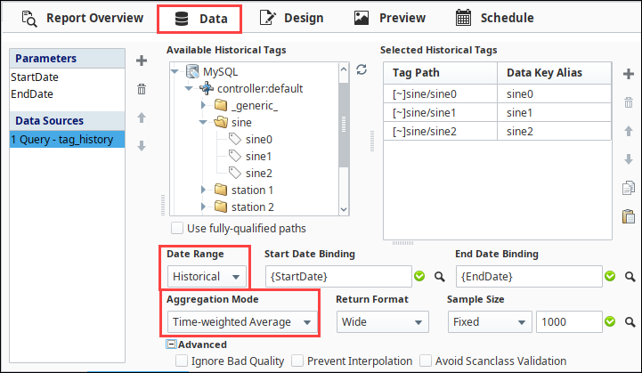
Under the Available Historical Tags column, open the folder structure until you locate your tags. As mentioned above, we are using the Programmable Device Simulator and loaded the Generic program. so we will select the 'generic' folder in this example. Here you'll find a bunch of tags you can use immediately. Expand the Sine folder.
-
Select a few of the tags (i.,e. sine0, sine1, sine2) and drag them to the Selected Historical Tags column under Tag Path. Take a look at the properties down at the bottom. Set the Data Range property to Historical, and the Aggregation Mode to Time-weighted Average.
Adding a Chart
Switch over to the Design panel now to add your chart.
-
Drag a Timeseries chart from the Report Design Palette into the report and expand the chart to fit the page.
-
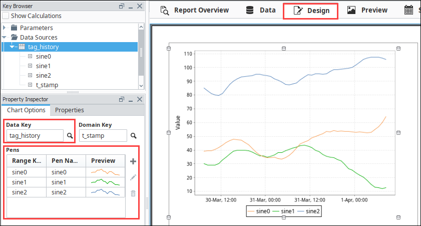
From the Key Browser, expand the Datasources folder, and drag your datasource (i.e., tag_history) down to the Data Key under the Chart Options tab of the Property Inspector. The Domain Key is auto-filled in with the t_stamp column name.
-
Select Test1 and Test2 pens and delete them by selecting each pen individually and then clicking the Trash
 icon.
icon. -
Once the Data Key is correct, you can assign pens to your chart. Drag in your Keys (i.e., sine0, sine1, sine2) to the Pens property table. You'll immediately notice your chart is populated with fake data, this is just a preview and does not represent the data returned by your data source.
-
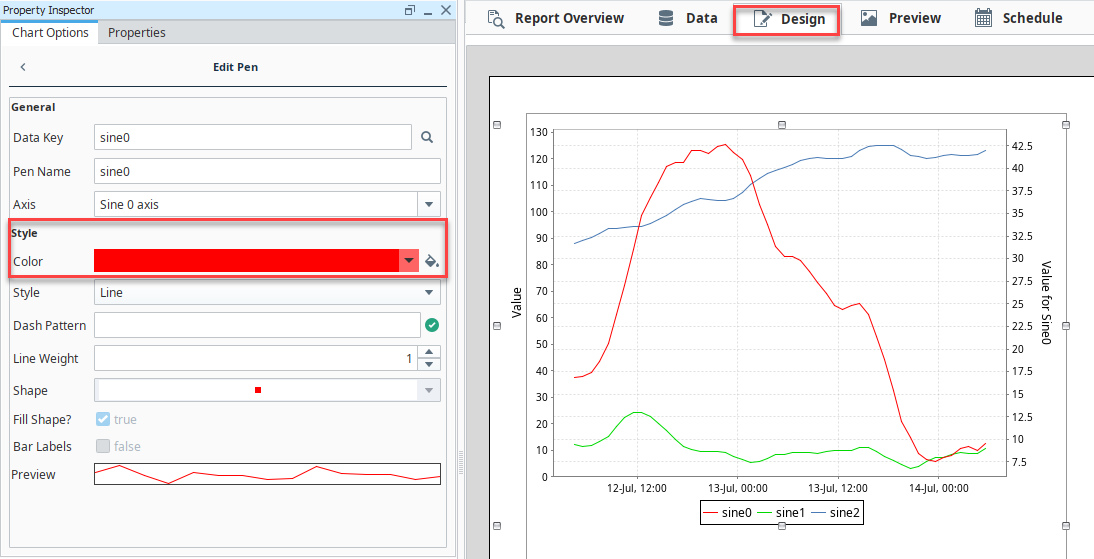
You can modify a selected pen by clicking the Edit
 icon or Preview column to open the Edit Pen tab. You can change the name of the pen, change the pen style, color, and more. Let's change the color of the pens, starting with the sine0 pen:
- Set the Color to be red.
- To return to the Chart Options tab, click the arrow
 button.
 - Repeat these steps for the remaining two pens, making sine1 green, and sine2 dark blue.
-
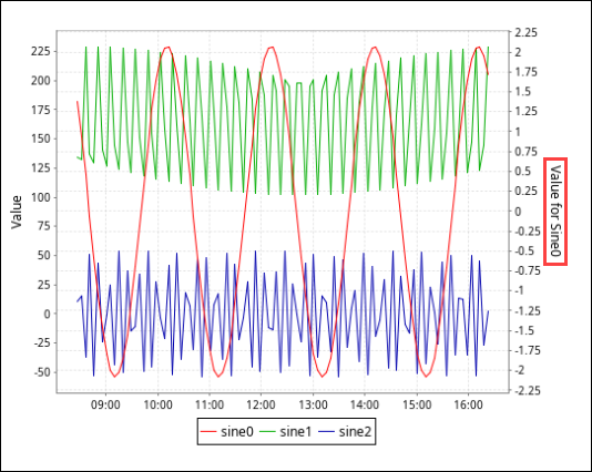
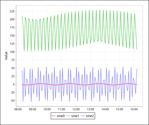
Go to the Preview tab to view the Timeseries Chart in the report.
Adding an Axis
It's hard to see the small changes in our sine0 pen because its range is smaller than the other pens. Let's fix this by adding a new axis.
-
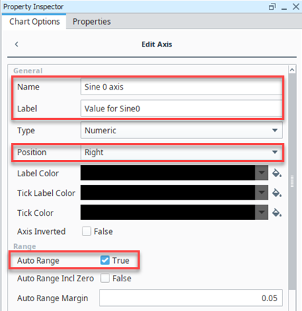
Return to the Design tab and select the chart. Click the Add
icon next to the Axes table to add a new axis, then click the Edit icon below it to edit our new Axis.- Give it a name of Sine 0 axis
- Give it a label of Value for Sine0
- Change the position to right so that it displays on the right side of the chart.
- We can leave Auto Range turned on, so that it will automatically pick the appropriate min and max for the sine0 pen.
-
Return to the Chart Options tab by clicking the arrow
button. -
We now need to tell our sine0 pen to use that new axis. Select the sine0 pen from the pens list and click the Edit
button. -
Change the Axis of the pen to one we just created.
-
Navigate to the Preview tab to view our finished chart.