Docked Views
Views can be anchored to an edge of a session. This configuration is called a docked view, as the view is "docked" to an edge in the session.
Docks are created in the Page Configuration interface. Note that only one docked view can be added to each edge position.
Configuring a Docked View
Docked views can be added to a page configuration in the following way:
- Select the page configuration you wish to add the dock to.
- Click the Add button on the desired edge. In this example, we'll add a north docked view by clicking at Add button at the top of the diagram.

- You'll see a popup tree showing all views in the project. At this point you'll select the view that will be placed in the docked. Select the desired view and click OK. You'll find your new dock has been added.
Editing an Existing Docked View
Once a view has been docked, it can be further customized via the Configure Docked View popup by left-clicking on the docked view's Edit  icon on the docked view configuration.

Docked View Properties
| Property Name | Description |
|---|---|
| View | The currently selected view. Changing this will change which view is mounted to this position. |
| Display | This property allows you to show or hide the docked view. See display. |
| Resizable? | Determines whether the docked view may be resized or not. |
| Modal? | Determines if the view should be modal, meaning users will not be able to directly interact with other views while the modal view is present. This property is only enabled when the Display property is set to onDemand. |
| Content | Determines how the docked view interacts with other views on the page. See content. |
| Anchor | Allows you to make a view always visible while scrolling. Only available on North docked view configurations. |
| Size | Determines the size, in pixels, of the view.
|
| Auto Breakpoint | Controls the minimum page width for Auto docked views to be visible. When the session is smaller than this width, these views will be hidden and able to be displayed on demand. This property is enabled when the Display property is set to auto. |
| Dock ID | An optional arbitrary string that can be used to reference a docked view through other parts of Perspective such as in an action or as a scripting call. |
| Handle | Allows you to show or hide a handle for users to expand/collapse the view. |
| Handle Icon | Path to an icon used to identify the view when the view is hidden. |
| View Parameters | Allows specific parameter values to be passed to the docked view when navigating to the page. |
| Remove | Deletes the view from the page. |
Display
| Option | Description |
|---|---|
| visible | The docked view is always expanded/displayed. |
| onDemand | The docked view is collapsed, but allows the user to display the view by clicking on the docked view's handle. |
| auto | Automatically shows or hides the docked view depending on how much space is available in the session: showing the view if the page is wider than the width specified in the auto-breakpoint setting. (Works in conjunction with the Auto Breakpoint property). |
Content
| Option | Description |
|---|---|
| push | Opening or closing the docked view causes the content in the center to resize: the center view will be 'pushed' out of the way. |
| cover | When opening the dock, it slides in front of the center view, obscuring part of the center view: the dock will 'cover' part of the center view. |
| auto | Acts like the cover option when the viewport is smaller than the Auto Breakpoint value. Acts like the push option when the viewport is larger than the Auto Breakpoint value. |
Example
Creating a View Parameter in a Docked View
- Select your docked view from the Project Browser.
- Click the Add
 icon for Add View Parameter in the Perspective Property Editor.
 - Click on Value and assign a name and a value. For example, Key:5000
- Verify the parameter input/output arrow
 is kept in the input direction.
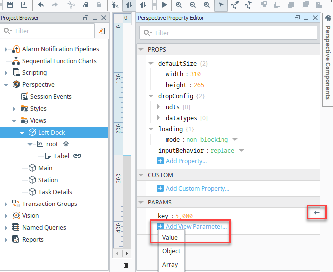
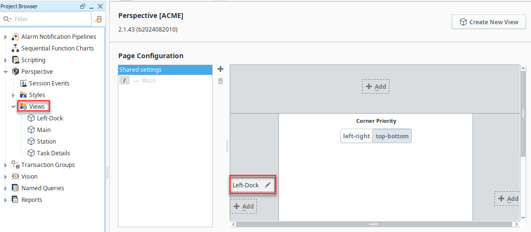
- Click on the Views folder in the Project Browser to go into Perspective's Page Configuration.
- Click on the Edit icon for your docked view.
- Click on the Add icon for Add Object Member and select the parameter you just created.
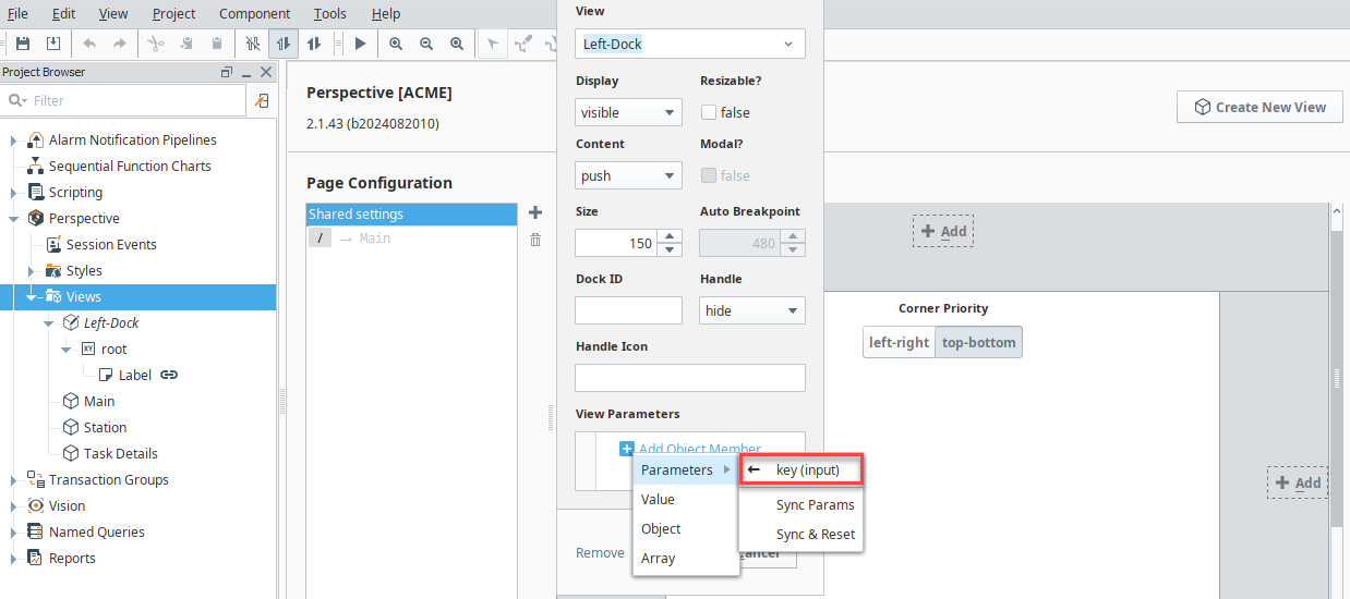
Now that you have a parameter created for your docked view, you can use it to dynamically pass data and display different data based on user input.