toBorder
This function is used by Ignition's Expression language.
Description
This function is used specifically when binding a Border property on a component. Typically, this is used with a Container or Label component but can be used on any component that has a Border property.
This function takes a string and converts it into a border. The string must be a semi-colon separated list of values. The first value is the name of the border, and the other values depend on the type of border you use. The following table defines the border types and the arguments they accept.
| Border Type | Options | Type | Style | Font Justification |
|---|---|---|---|---|
| bevel | bevelType | 0 = Raised 1 = Lowered 1010 = Double | ||
| button | none | |||
| etched | etchType | 0 = Raised 1 = Lowered | ||
| etchedtitled | title; style; fontJustification; fontPosition; fontColor; font | 0 = Etched / Lowered 1 = Etched / Raised 2 = Beveled / Lowered 3 = Beveled / Raised 4 = Beveled / Double 5 = Standard | 1 = Left 2 = Center 3 = Right 4 = Leading 5 = Trailing | |
| field | none | |||
| line | color; thickness | |||
| linetitled | title; width; lineColor; fontJustification; fontPosition; fontColor; font | 1 = Left 2 = Center 3 = Right 4 = Leading 5 = Trailing | ||
| matte | color; topWidth, leftWidth; bottomWidth; rightWidth | |||
| paneltitled | title; style; mainColor; bgColor, shadowSize, fontJustification; fontPosition; fontColor;font | 1=Gradient / West-to-East 2=Gradient / North-to-South 3=Gradient / East-to-West 4=Solid | 1 = Left 2 = Center 3 = Right 4 = Leading 5 = Trailing |
To use this function, you need to include the border type and then any options you want to use in the correct order, for example:
toBorder("paneltitled; title; style; mainColor; bgColor; shadowSize; fontJustification; fontPosition; fontColor;font")
The use of toBorder can conflict with other configurations, typically Styles. If you notice red text on the border property after applying toBorder in an expression binding, it's likely due to a Style being applied to the border property.

In this case you would need to remove the style configuration:
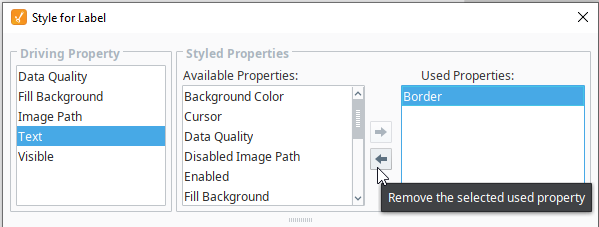
- From the Designer, right-click the component and select Style Customizer
- Under the Used Properties list, select Border
- Click left arrow to remove Border from the list.
- Click OK to close the Style Customizer.
Syntax
toBorder(value, [failover])
Parameters
| Type | Parameter | Description |
|---|---|---|
| String | value | The value to type cast. |
| Object | failover | The failover value if type casting fails. [optional] |
Results
Border - The value type cast as a border object.
Examples
toBorder("bevel;1010") //returns this...
toBorder("button")
toBorder("etched;0")
toBorder("etchedtitled;Title;5;3;right;green;Arial")
toBorder("field")
toBorder("line;blue;2")
toBorder("linetitled;Title") //returns this...
toBorder("matte;red;10;1;1;1") //returns this...
toBorder("paneltitled;Options;1;grey;white;0;3;0;green;Dialog,bold,16") //returns this...
