Working With Power Table Extension Functions
The Power Table offers significantly more configuration options than the classic Table, including a number of extension functions, which allow further configuration of the Power Table's functionality and appearance using scripting. This page describes the configuration options offered by the Power Table extension functions.
Overview
The Power Table component offers the ability to greatly expand available configuration options by enabling and defining its extension functions. Available functions are listed in the left pane of the Component Scripting window. Any number (or none at all) of the functions may be defined on the same Power Table component as needed.
Each extension function has a Python-style Docstring documenting the parameters the function takes and what the function returns. The parameters are passed into the function by the table component and their values are available for use inside the function definition. This means that each function has a predefined list of parameters and a specific return value, neither of which can be changed.
Extension Functions vs. Event Handlers
Unlike an event handler function, an extension function is called by the table component itself. This means that the function does not need to be called separately. If the Enabled box is checked, the table will call the function and execute the code inside the function definition.
Calling Extension Functions
Another difference between extension functions and event handlers is when they are called. While some extension functions, like onMousePress or onPopupTrigger, are called in response to a specific event, other functions, like configureHeaderStyle or configureCell, will run every time the table's dataset is refreshed, and yet other functions like initialize or configureEditor will run only when the table first loads. When implementing a particular extension function, make sure to consider when and how many times each function is called in order to avoid introducing undesirable results, such as extended execution times.
Filtering Using Function Parameters
Extension function parameters can be used to to selectively apply the formatting defined in the function body. Below is the list of parameters and examples of some of the common conditions that can be used. When using examples offered below, make sure to verify the specific parameter used in the filter condition is available in the function you are defining.
Filter by rowIndex, colIndex, colName
This allows you to apply modifications only to specific row(s) and/or column(s).
| Purpose | Code |
|---|---|
| Apply the changes only to the leftmost column of the table’s dataset. | if colIndex == 0: |
| Apply the changes only to the first (“zero-th") row of the table’s dataset. | if rowIndex == 0: |
| Apply the changes to every even-numbered column of the table’s dataset. | if colIndex % 2 == 0: |
| Apply the changes to every 10th row of the table’s dataset. | if rowIndex % 10 == 0: |
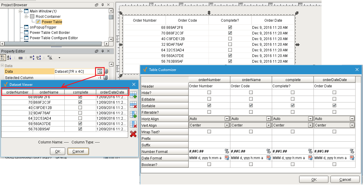
Instead of colIndex, you can filter for colName, which refers to the name of the table dataset column. This is useful when you are not certain what the order or the column would be (e.g. the query on the Data property binding is dynamic, and column order may change). Another common use case is applying the changes to a number of columns with names following a particular naming convention.
| Purpose | Code |
|---|---|
| Apply changes to the orderNumber column. | if colName == "orderNumber": |
| Apply changes to all columns whose names contain the word "order", such as orderName, orderDate, orderNumber. | if "order" in colName: |
When filtering for colName, make sure to use the name as shown in the table's Data property dataset viewer. This is especially important if the column names have been changed using the Table Customizer.
It is also possible to filter using row or column order as they appear on the screen, which can be different from their order in the dataset if sorting was applied, or if columns were hidden or otherwise rearranged:
| Purpose | Code |
|---|---|
| Apply changes to every even-numbered row as shown in the table, even if the row order was re-arranged by sorting or filtering. | if rowView % 2 == 0: |
Filter for the Cell Currently Selected by the User
This allows you to define changes based on whether the cell is selected or not.
| Purpose | Code |
|---|---|
| Apply changes only to the currently selected cell. | if selected: |
| Apply changes to all cells except the currently selected cell | if not selected: |
Filter Based on the Cell Value
Some extension functions have value, textValue, newValue, and oldValue parameters available.
The value parameter refers to the value as defined in the table’s Data dataset.
In contrast, the textValue parameter applies to the value as it is displayed in the table column after any formatting used has been applied. Filtering on this parameter value is useful when, for example, a certain date format has been set for the date column using the Table Customizer.
The newValue and oldValue parameters, when available, can be used to filter based on what the value being edited changed from or to.
| Purpose | Code |
|---|---|
| Apply changes only if the value in the cell is greater than 100. | if value > 100: |
| Apply changes only if the value in the cell is less than the value in the cell to its right. | if value < self.data.getValueAt(rowIndex, colIndex+1): |
| Apply changes only if the displayed cell value contains Sunday. | if "Sunday" in textValue: |
| Apply changes only if the cell value is being changed to a lesser value. | if newValue < oldValue: |
Be careful comparing across the board if table has non-numeric columns as you will likely get unexpected results. For details on comparisons between different datatypes in Python, see https://docs.python.org/2/library/stdtypes.html#comparisons
Filter Based on Properties of the Power Table Component
Filtering options are not limited to the parameters of the extension function being defined. Extension functions also allow filtering based on the properties of the Power Table component itself, or properties of other components on the screen.
| Purpose | Code |
|---|---|
| Apply changes only if the table’s Data property dataset has more than 10 columns. | if self.data.columnCount > 10: |
| Apply changes only if the table’s Sorting Enabled property is set to True (the checkbox is checked). | if self.sortingEnabled: |
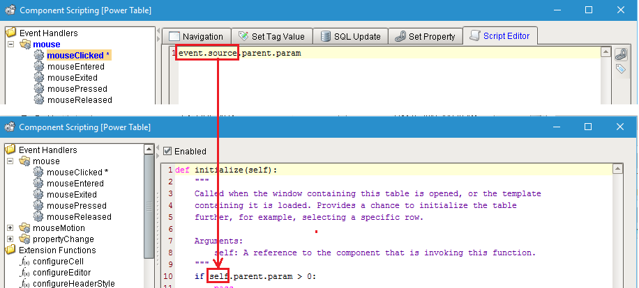
| Apply changes only if the value of the param property on the table's parent component is greater than 5. | if self-parent.param > 5: |
You can check the scripting names of the properties listed in the Property Editor by hovering over the property name or by using an event handler function on the same Power Table, and then replacing the event.source part of the reference with self (both of which are references to the Power Table component you are working with).
Working with Specific Functions
configureCell
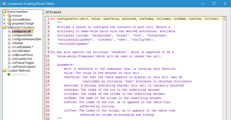
The configureCell extension function provides a way to configure a cell's background and foreground colors, font properties, vertical and horizontal alignment of the text in the cell, cell text itself, icon displayed along with or instead of cell text, and any tooltip text shown when the cell is hovered over.
This function runs once for each cell, every time the cell needs to render. This means that for a table with 10 rows and 10 columns, this function will be called at least 100 times (at least once for each of the 100 cells) when the table initializes, or when the dataset is refreshed, etc. This should be taken into account when implementing this function, and any potentially long running code should be avoided.
The value given to the return statement of the function must be a dictionary of name-value pairs. The general format for such dictionary is: {"attribute1": value1, "attribute2": value2}
Configure Cell Background and Foreground Colors
Cell background and foreground (font) color are some of the most common attributes to configure.
The color value used to set these properties should be of type Color (java.awt.Color), or a 6-digit hexadecimal color string preceded by the hash (#) sign (e.g. '#FFFFFF'). On newer version of Ignition, where the system.gui.color function is available, it can be used to create a Color object.
| Purpose | Code |
|---|---|
| Set background color to light blue for every even column. | if rowIndex % 2 == 0: |
| Invert colors for the selected row: set the background color to a darker shade of blue, set the foreground (font) color to a light shade of blue. | if selected: |
| Use different shades of blue to set the row background color to alternate between white, light blue, and slightly darker blue. Keep the selected row background default. | if selected: |
Configure Cell Border
The border attribute allows to modify how the cell border is rendered. It expects a value of type javax.swing.border.Border.
| Purpose | Code |
|---|---|
| Display a 2-pixel thick red border around the currently selected cell. | from javax.swing.border import LineBorder |
Please refer to the class API documentation at the link above for detailed information on available border types and available constructors.
Configure Cell Font
The font attribute allows changing font (font face, variant, color, thickness, and some other properties). This attribute expects a value of type java.awt.Font.
| Purpose | Code |
|---|---|
| Set font face, weight, and size for cells whose value is less than 25. | if colName == "results" and value < 25: |
To ensure visual consistency across all systems running the project, specify only fonts that you know will be available on the Client machines.
Configure Horizontal and Vertical Alignment
- Horitontal Alignment: By default, Power Table cell content is right-aligned for numeric column types, left-aligned for String and Date column types and centered for Boolean column types or Integer column types set to display as Boolean using the Table Customizer. This can be customized by setting the horizonalAlighment property to LEFT, CENTER, or RIGHT constants from the javax.swing.SwingConstants class.
| Purpose | Code |
|---|---|
| Right-align text in all cells. | from javax.swing import SwingConstants |
- Vertical Alignment: By default, Power Table cell content is vertically centered. This can be customized by setting the
verticalAlignmentproperty to TOP, CENTER, or BOTTOM constants from the javax.swing.SwingConstants class. Row height may need to be increased for the visual difference to show.
| Purpose | Code |
|---|---|
| Bottom-align text in all cells. | from javax.swing import SwingConstants |
Modify Displayed Text, Add Icons and Tooltips
The iconPath property allows to specify a path to the icon stored using the Image Management tool.
| Purpose | Code |
|---|---|
| Change the text of cells in the specified column if the cell value is less than 10. | if colName == "Results" and value < 10: |
| Add an icon to the text of cells in the specified column if the cell value is less than 10. | if colName == "Results" and value < 10: |
| Replace text in the cells in the specified column with an icon if the cell value is less than 10. | if colName == "Results" and value < 10: |
| Specify tooltips for the cells in the column depending on the value. | if colName == "Results": |
| Move the cell text to tooltip; make the cell display a specific icon depending on the value in the cell. | if colName == "Results": |
configureEditor
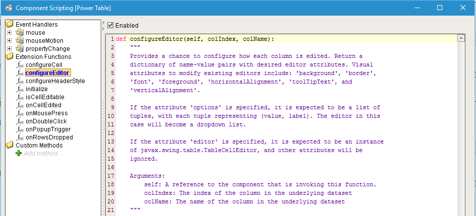
The configureEditor extension function allows to configure the visual attributes of the cell editor for all cells in the specified editable column. Unlike the changes applied using the configureCell function, this function allows to customize the appearance and behavior of an editable cell when it is being edited.
| Purpose | Code |
|---|---|
| When a cell is being edited, set its background to light blue, use dark blue 15-pixel bold Sans-serif font, horizontally center cell contents, and specify the tooltip. | from java.awt import Font |
| Make the table cell display a dropdown list. | shifts = [(0, 'AM Shift'), (1, 'PM Shift')] |
For advanced configuration options, the editor property can be specified. This is advanced functionality requiring the ability to work with Java Swing API. For more information, please refer to javax.swing.table.TableCellEditor class documentation.
configureHeaderStyle
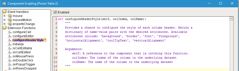
The configureHeaderStyle extension function provides a way to configure the background and foreground colors, border style and color, font properties, vertical and horizontal alignment of the text, as well as any tooltip text of the Power Table's header.
The value given to the return statement of the function must be a dictionary of name-value pairs. The general format for such dictionary is {"attribute1": value1, "attribute2": value2}
| Purpose | Code |
|---|---|
| Configure the visual attributes of cell headers: make the background light blue, the font and border color dark blue; set font to 15 pixel bold Sans-serif, align text to the bottom of the header row. This example also shows how to set different border width for the 4 sides of the border box using the javax.swing.border.MatteBorder class. In this case the top border is 3 pixels wide, the bottom border is 2 pixels wide and side borders are invisible (0 pixels wide). For more information on border options, see https://docs.oracle.com/javase/8/docs/api/javax/swing/border/package-summary.html | from java.awt import Font |
initialize
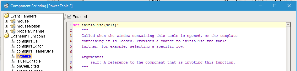
The initialize extension function allows to set up the table when it is first loaded (e.g. when the window first opens). It is not called again until next time the table is loaded (e.g. the window containing the table is closed and reopened).
| Purpose | Code |
|---|---|
| If the table's Data dataset has more than 10 rows, adjust row height and font and enable row resizing. This example also shows a way to set font face using the Font class constants. | from java.awt import Font |
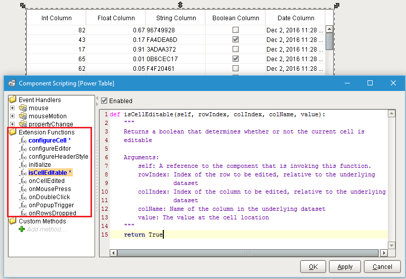
isCellEditable
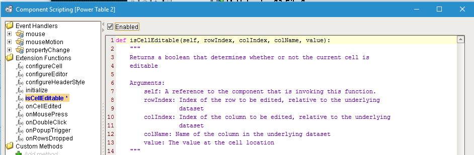
The isCellEditable extension function allows to make the current cell editable based on whether the specified condition is met.
| Purpose | Code |
|---|---|
| Make a cell in the "Result" column editable if its value is < 50. | if colName == "Result" and value < 50: |
onMousePress and onDoubleclick
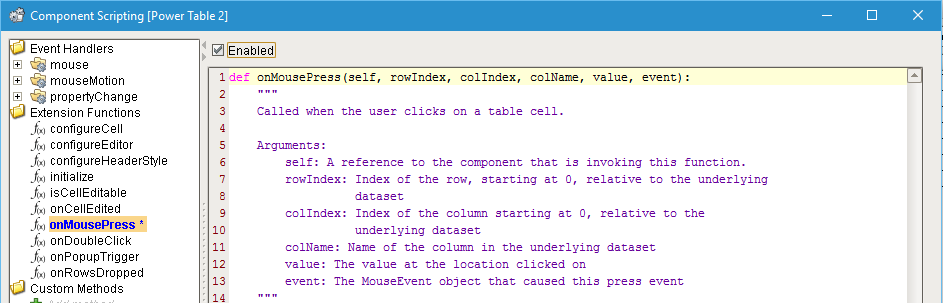
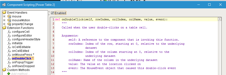
The onMousePress extension function allows to define actions for single left click event. The onDoubleClick extension function allows to define actions for the double left click event. Note that on systems using touch screens the double-click may not be available. Make sure to use these function (not the mouseClicked event handler function) for single or double left click events for better reliability, and to future-proof your code.
| Purpose | Code |
|---|---|
| If the length of the URL string with surrounding white space removed in the table's "URL" column is greater than 0, open that URL in the Web Browser component when the URL is clicked. | url = value.strip() |
onPopupTrigger
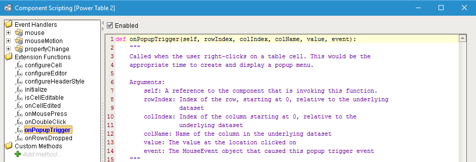
The onPopupTrigger extension function allows to create a right-click popup menu. The menu will be aware of what cell called it. This information may be used to create a menu specific to the row, column, or cell, or can be ignored to create a generic menu for the whole table.
| Purpose | Code |
|---|---|
| Create a generic right-click popup menu with options to export the table data as CSV or to print the table. | def exportCSV(event): |
| Create right-click popup menu with options to delete or duplicate the selected row. | def deleteRow(event): |
onRowsDropped
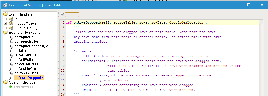
The onRowsDropped extension function allows to define what should happen when a row from another Power Table on the same window is dropped onto the Power Table that has this function defined. It must be defined on the destination table for row drag-and-drop to work. The function definition should have the code to append the new row to the existing dataset.
| Purpose | Code |
|---|---|
| Drop one or more rows from source table into the destination table when both tables have the same number and type of columns, in the same order: | for rowNdx in range(rowData.rowCount): |