Vision - Report Viewer
Component Palette Icon:
Description
The Report Viewer component provides a way to run and view Reports in Vision windows. Parameters added during Report creation are provided as Properties in the Viewer and can override any default values set in the Report Resource. Right clicking on the Report Viewer brings up a menu that allows you to easily print the report or save it in various formats.
To begin using the Report Viewer, the project must first have at least one report configured. Once a report exists in the project, then the Report Path property on the Report Viewer can be used to select the report, which will cause the component to render the selected report. If the report has any parameters, those will be exposed under the Report Parameters category in the Property Editor, allowing you to configure bindings on them.
Interface Elements
| Element | Description |
|---|---|
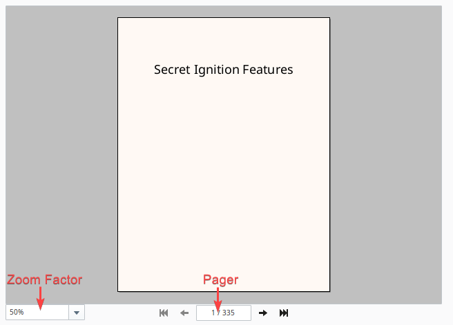
| Zoom Factor | Determines the zoom level of the rendered report. |
| Pager | Determines which page is currently shown in the report viewer. |
| Right Click | Right-clicking on the rendered report will present a popup menu, allowing the user to save a copy of the report, or print it out to an available printer. |
Properties
| Property | Description | Property Type | Scripting | Category |
|---|---|---|---|---|
| Background Color | Color that lays underneath the report. Can be chosen from color wheel, chosen from color palette, or entered as RGB or HSL value. See Color Selector. | Color | .background | Appearance |
| Border | The border surrounding this component. Options are No border, Etched (Lowered), Etched (Raised), Bevel (Lowered), Bevel (Raised), Bevel (Double), and Field Border. Note: The border is unaffected by rotation. Changed in 8.1.21 As of 8.1.21, the "Button Border" and "Other Border" options are removed. | Border | .border | Common |
| Current Page | Current page in the report you would like to view. | Int | .currentPage | Data |
| Fit Panel | Ignore the zoom and fit the report to the component. | Boolean | .fitPanel | Data |
| Foreground Color | The foreground color the labels on the component. See Color Selector. | Color | .foreground | Appearance |
| Name | The name of this component. | String | .name | Common |
| Page Count | Number of pages in the report. | Int | .pageCount | Data |
| Report Loading | Returns true while the report is loading. Note: This property does NOT appear in the Property Editor, but can easily be accessed from a Python script. Useful in scenarios where you wish to change the value of a parameter on the Report Viewer in a script and then do some additional work once the report has finished loading. | Boolean | reportLoading | N/A |
| Report Path | Path in the Project to the Report you would like to view. | String | .reportPath | Data |
| Show Controls | Show the bar with the page and the zoom controls. | Boolean | .showControls | Appearance |
| Suggested Filename | The filename that will come up by default when the user saves the report to disk. | String | .suggestedFilename | Behavior |
| Visible | If disabled, the component will be hidden. | Boolean | .visible | Common |
| Zoom Factor | Zoom factor for the rendered report. This property directly controls the zoom factor interactive element displayed on the component. | Float | .zoomFactor | Data |
Report Parameters Category
The Report Viewer component features a dynamic subset of properties under the Report Parameters category. This category is populated by report parameters that are defined on the reported specified by the Report Path property.
Scripting
See the Vision - Report Viewer Scripting Functions page for the full list of scripting functions available for this component.
Event Handlers
Event handlers allow you to run a script based off specific triggers. See the full list of available event handlers on the Component Events page
Examples
#This example will check if the report has finished loading. If so, print the report.

#Reference the report viewer
reportViewer = event.source.parent.getComponent('Report Viewer')

if reportViewer.reportLoading:
    system.gui.warningBox("The report is still loading. Please wait")
else:
    reportViewer.print()