Vision - Alarm Status Table

Component Palette Icon
The alarm status table displays the current state of the alarms available to the gateway (including those provided by Remote Tag Providers). It can be configured to show active, unacknowledged, cleared, and acknowledged alarms. By default it shows all non-cleared/non-ack'ed alarms. Acknowledgement is handled by selecting (checking) alarms and pressing the "Acknowledge" button. If any of the selected alarms require acknowledge notes, then a small text area will be presented in which the operator must add notes to the acknowledgement.
The Alarm Status Table component allows you to select an individual alarm, multiple alarms, or the Select All checkbox in the header bar. You can also use the Shift+Click multi select feature to select a range of alarms for acknowledging and shelving. Check one alarm and Shift+Click another alarm several rows down. All of the alarms between them, including the one you shift clicked, will be selected
Interface Elements
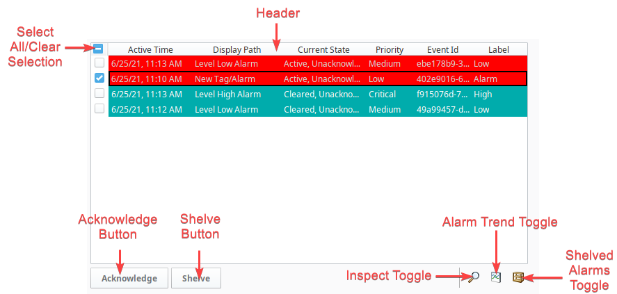
Below is a listing of interface elements on the Alarm Status Table component. Note that these interactions are available from a Vision Client, as well as the Designer while Preview Mode is enabled.
| Name | Description |
|---|---|
| Selecting an Entry | Click on an entry in the to select it. The Checkboxes on the left of an entry can also be used to select the entry. Holding Shift while clicking allows for selecting a range of entries. |
| Header | Entries in the Alarm Status Table can be sorted by each column. Simply click on the desired column header to sort by that column. Holding the Ctrl key while clicking on column headers will allow for sorting across multiple columns. Columns can be reordered in the Vision Client by simply dragging and dropping them. In addition, right-clicking on the header will bring up a list of available columns to show or hide.  |
| Select All/Clear Selection | The checkbox in the upper left corner of the component can be used to select all entries in the table, as well as clear selection from all entries. |
| Acknowledge Button | Pressing this button will acknowledge the selected alarm(s). |
| Shelve Button | Pressing this button will shelve the selected alarm(s). |
| Inspect Toggle | Pressing this toggle will bring up the Inspection panel, allowing you to view more details on the selected alarm. |
| Alarm Trend Toggle | Pressing this toggle will bring up a chart, showing the recent historical values of the selected entries. This feature requires that the tag the alarm is configured on is being recorded by the Tag Historian system. In addition, creating an Alarm Journal Profile and setting the Alarm Status Table's Journal Name property will create annotations on the chart, highlighting past alarm events. 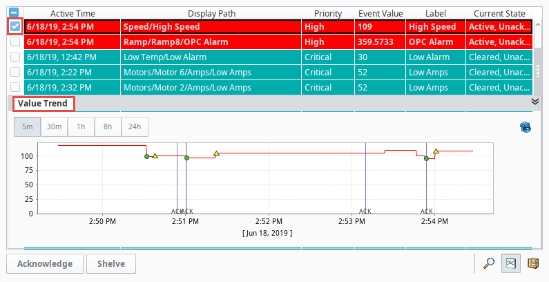 |
| Shelved Alarms Toggle | Pressing this toggle will display a panel that shows all currently shelved alarms in the system. From here shelved alarms can be unshelved. |
Filtering
The Property Editor has a dedicated Filtering category of properties where you can configure determine which alarms appear on the component. By default, all alarms within the system appear on the table, but in many cases it can be desirable to only show a subset of alarms on the component at a time. Strings can be entered in these fields including wildcards to show specific subsets of alarms. These filtering properties can also be bound so the paths are dynamically created. Finally, you can enter multiple comma-delimited values to filter by.
Display Path Filtering
The Display Path can be customized on each alarm. The default value for an alarm's Display Path is a tag path that leads to the name of the alarm. The image below, the top row has an alarm named Alarm, and is located on a tag path of Alarming Example/Integer Tag, thus the Display path will resolve to 'Alarming Example/Integer Tag/Alarm'. However, the Display Path can be customized when configuring the alarm. This is generally utilized to display readable messages as to what the issue is.
To filter entries on the table by the Display Path, simply set a value on the Display Path Filter property. The * wildcard can be used in the Display Path Filter.

Source Path Filtering
The Source Path is also a path to the alarm, but also shows the Tag Provider the alarm is located in. Again using the image above, if the name of the Tag Provider is 'default', then the source path would resolve to 'prov:default:/tag:Alarming example/Integer Tag:/alm:Alarm'. Unlike the Display Path, the Source Path on an alarm can never be overridden.
To filter entries on the table by Source Path, simply set a value on the Source Filter property. The * wildcard can be used in the Source Filter. See the Source Path Filter Examples table below for more information.
Source Path Filter Examples
The source path is made up of the alarm name, the tag path to the host tag, and the Tag Provider the tag resides in. This means the Source Filter property can be used to filter on tag folders and Tag Providers. For example, you may want the table to only show alarms that contain a certain term or folder path. The table below demonstrates some filters as well as some hypothetical results.
| Example Filter | Result |
|---|---|
prov:tagProvider:/tag:Inputs/PS_1:/alm:MyAlarm | Retrieve alarm information from the alarm at precisely the specified path:prov:tagProvider:/tag:Inputs/PS_1:/alm:MyAlarm |
*PS_1:/alm:MyAlarm | Retrieves alarm information from any path that ends with PS_1:/alm:MyAlarm. Thus the following paths would be returned:prov:tagProvider:/tag:Inputs/PS_1:/alm:MyAlarmprov:tagProvider:/tag:anotherFolder/different_Path/PS_1:/alm:MyAlarm |
prov:tagProvider:/tag:PS_* | Retrieves alarm information from any source path starting with "prov:tagProvider:/tag:PS_", such as:prov:tagProvider:/tag:PS_1:/alm:MyAlarm1prov:tagProvider:/tag:PS_2/Tag2:/alm:MyAlarm2 |
*MyAlarm* | Retrieves any alarm information that has MyAlarm somewhere in the path. |
State Filtering
The component can also filter entries based on the state of an alarm event. For example, the component can be configured to show only active alarms by enabling the Show Active and Unacked and Show Active and Acked properties.
Priority Filtering
The component can also filter alarm events based on a minimum priority level, allow the component to ignore lower priority alarm events. This is handled by the Min Priority property.
Alarm Property Filtering
Entries in the table can be filtered base on values of alarm properties by using the filterAlarm extension function. This includes Alarm Associated Data properties. See How to Filter by Associated Data on the Vision Alarm Status Table.
Properties
| Name | Description | Property Type | Scripting | Category |
|---|---|---|---|---|
| Border | The border surrounding this component. Options are No border, Etched (Lowered), Etched (Raised), Bevel (Lowered), Bevel (Raised), Bevel (Double), and Field Border. Note: The border is unaffected by rotation. Changed in 8.1.21 As of 8.1.21, the "Button Border" and "Other Border" options are removed. | Border | .border | Common |
| Chart Resolution | The resolution for the ad-hoc tag historian chart. | int | .chartResolution | Behavior |
| Date Format | A date format pattern used to format dates in the table. If blank, the default format for the locale is used. | String | .dateFormat | Appearance |
| Data Quality | The data quality code for any Tag bindings on this component. | int | .dataQuality | Deprecated |
| Display Path Filter | Filter alarms by alarm display path, falling back to the source path if a custom display path isn't set. Specify multiple paths by separating them with commas. Supports the wildcard "*", which represents any number of characters. In the example below, only alarms that contained "High Temperature Alarm" would appear in the table. *High Temperature Alarm* | String | .displayPathFilter | Filters |
| Duration Format | Formats styles for fields like Active and Ack durations: Long, Short, Compact, and Abbreviated. Duration Format property, allows users to format the time units on the Active Duration column. | int | .durationFormat | Appearance |
| Enabled | If disabled, a component cannot be used. | boolean | .componentEnabled | Common |
| Flash Interval | The time interval to use for flashing row styles. | int | .flashInterval | Appearance |
| Journal Name | The name of the alarm journal to query for the chart's annotations. Leave this blank to automatically pick the journal if there is only one. | String | .alarmJournalName | Behavior |
| Marquee Mode | Turn the table into a scrolling marquee | boolean | .marqueeMode | Behavior |
| Min Priority | The minimum priority alarm to be displayed by this table. | int | .minPriority | Filters |
| Multi Select | Allow multi select. Will show/hide the checkbox column. | boolean | .multiSelect | Behavior |
| Name | The name of this component. | String | .name | Common |
| Notes Area Border | The border surrounding the notes area. | Border | .notesAreaBorder | Appearance |
| Notes Area Font | The font for the notes area. | Font | .notesAreaFont | Appearance |
| Notes Area Location | The location of the notes display area. | int | .notesAreaLocation | Appearance |
| Notes Area Size | The size of the notes area, in pixels. | int | .notesAreaSize | Appearance |
| Number Format | A number format string to control the format of the value column. | String | .numberFormat | Appearance |
| Provider Filter | Filter alarms by Tag Provider. Specify multiple providers by separating them with commas. A value of "." denotes the default Tag Provider. | String | .providerFilter | Filters |
| Quality | The data quality code for any Tag bindings on this component. | QualityCode | .quality | Data |
| Refresh Rate | The rate at which this table will poll changes to the alarm status, in milliseconds. | long | .refreshRate | Behavior |
| Row Height | The height, in pixels, for each row of the table. | int | .rowHeight | Appearance |
| Row Styles | A dataset containing the different styles configured for different alarm states. | Dataset | .rowStyles | Appearance |
| Scroll Delay | The time in milliseconds to wait between performing each step in a scroll | int | .scrollDelay | Behavior |
| Selected Alarms | A dataset containing each selected alarm. (Read-only) | Dataset | .selectedAlarms | Data |
| Selection Color | The color of the selection border. Can be chosen from color wheel, chosen from color palette, or entered as RGB or HSL value. See Color Selector. | Color | .selectionColor | Appearance |
| Selection Thickness | The size of the selection border. | int | .selectionThickness | Appearance |
| Shelving Times | This dataset holds the times that are suggested when shelving an alarm. New entries added to this dataset will be selectable by users when they attempt to shelve an alarm on the component. Allowable units are second, minute, hour, or day. | Dataset | .shelvingTimes | Data |
| Show Ack Button | Show the acknowledge button on the footer panel. | boolean | .showAck | Appearance |
| Show Active and Acked | Show alarms that are active and acknowledged. | boolean | .activeAndAcked | Filters |
| Show Active and Unacked | Show alarms that are active and unacknowledged. | boolean | .activeAndUnacked | Filters |
| Show Chart Button | Show the chart button on the footer panel. | boolean | .showChart | Appearance |
| Show Clear and Acked | Show alarms that are cleared and acknowledged. | boolean | .clearAndAcked | Filters |
| Show Clear and Unacked | Show alarms that are cleared and unacknowledged. | boolean | .clearAndUnacked | Filters |
| Show Details Button | Show the view details button on the footer panel. | boolean | .showDetails | Appearance |
| Show Footer | Show a footer with acknowledge and shelf functions below the alarms. | boolean | .showFooterPanel | Appearance |
| Show Header Popup | Toggles the table header's built-in column selection popup menu. | boolean | .showTableHeaderPopup | Appearance |
| Show Manage Shelf Button | Show the manage shelf button on the footer panel. | boolean | .showManageShelf | Appearance |
| Show Shelve Button | Show the shelve button on the footer panel. | boolean | .showShelve | Appearance |
| Show Table Header | Toggles visibility of the table's header. | boolean | .showTableHeader | Appearance |
| Sort Oldest First | Sort times by oldest first. | boolean | .sortOldestFirst | Behavior |
| Sort Order | The default sort order for alarms in the status table. | int | .sortOrder | Behavior |
| Source Filter | Filter alarms by alarm source path, causing the table to only show alarms that match the filter. Specify multiple paths by separating them with commas. Supports the wildcard "*". See Source Path Filter Examples. | String | .sourceFilter | Filters |
| Stay Delay | The time (in mSec) to wait between scrolls | int | .stayDelay | Behavior |
| Table Background | The background of the alarm table. See Color Selector. | Color | .tableBackground | Appearance |
| Table Font | New in 8.1.14 The font for the table rows. | Font | .font | Appearance |
| Table Header Alignment | New in 8.1.14 The alignment for each column in the table header. | int | .headerAlignment | Appearance |
| Table Header Font | The font for the table header. | Font | .tableHeaderFont | Appearance |
| Touchscreen Mode | Controls when this input component responds if touchscreen mode is enabled. | int | .touchscreenMode | Behavior |
| Visible | If disabled, the component will be hidden. | boolean | .visible | Common |
Scripting
See the Vision - Alarm Status Table Scripting Functions page for the full list of scripting functions available for this component.
Event Handlers
Event handlers allow you to run a script based off specific triggers. See the full list of available event handlers on the Component Events page
Customizers
Examples
Example 1 - Filter by Associated Data
Click here to see the User Manual page on filtering the Alarm Status Table by Alarm Associated Data,
Example 2 - Restrict Acknowledgement
Click here to see the User Manual page on Restricting Acknowledgement on the Alarm Status Table.