Vision - Tree View Customizer
Description
The Tree View has its own customizer which allows you to easily configure the items dataset property. The customizer provides some useful dropdowns and color selectors for certain properties that require more than just a name or a path. You can add and remove nodes, and change the node hierarchy and appearance through the properties in the dataset.
While the Customizer allows you to configure the columns of the Items dataset, the customizer will not display any columns that the user adds to the dataset. However, user added columns are still configurable in the dataset itself, and can be used to store additional information about each item such as a window path.
Customizers
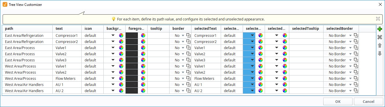
The Tree View Customizer allows you to easily configure how you want the tree view to look to users. When you open the customizer for the first time, you'll notice the dataset contains some predefined nodes and settings. Each row in the dataset represents a node in the tree. Each column in the dataset represents properties that configure the appearance of the tree to look a certain way.
Configuring the Tree View Customizer is very straightforward. To add a node to the tree, click the green icon on the right side of the window, and a new row will be added at the the bottom of the dataset. All the columns will default to the predefined properties with the exception of the "path" to the node's location. This field will be blank so you need to enter a path to the node. You can edit any of the of the preset properties. At a minimum, you should always edit the Text and SelectedText properties replacing the default names with a more appropriate name so the item is easily identifiable when it is selected and unselected in the tree. You can also move a node up or down the tree hierarchy using the Move Up or Move Down arrows on the right side of the window. To delete a node from the tree, simply select the node and hit Delete.
The additional properties are optional, but can enhance your tree view for your users. For example:
- To change an icon for any node in the tree, choose an icon from the Image Management Tool. All you need to do is right click on the icon in the Image Management tool and select Copy Path, and paste it in the Icon field for that node.
- Add a tooltip for any item in the tree by simply typing in your tooltip in the Tooltip field for that node. When you hover over the item in the tree view, you'll see your tooltip.
- Add a foreground and background color for any item in the tree when it is selected or unselected.
- Add a border for any item in the tree when it selected or unselected.
The references to optional properties in the table below mean that a dataset does not need to have them present in the dataset for the tree to render and function.
Properties
| Property | Description |
|---|---|
| Path | Path that determines the node's locaton. Broken up into a list by splitting on the separation character. |
| Text | Text of the node while not selected. |
| Icon | Path to an icon for the node. Use the value: "default" to use the tree automatic folder/leaf icons. (optional) |
| Background | Controls the background appearance of the unselected item. A string column that will be coerced into a color for the unselected background. (e.g., "white" or "(255,255,255)". Use an empty string to use the default color. (optional) |
| Foreground | Control the foreground appearance of the unselected item. A string representation of the unselected foreground color. (optional) |
| Tooltip | If not empty, will be use as the tooltip for the node. (optional) |
| Border | A string that will be coerced into a border for the node while unselected. May be empty. (optional) |
| SelectedText | Text of the node while selected. (optional) |
| SelectedIcon | A path to an icon for the node while selected. Use the value: "default" to use the tree automatic folder/leaf icons. (optional) |
| SelectedBackground | Controls the background appearance of the selected item. A string representation of the the selected background color. (optional) |
| SelectedForeground | Controls the background appearance of the selected item. A string representation of the selected foreground color. (optional) |
| SelectedTooltip | If not empty, will be used as the tooltip for the node while selected. (optional) |
| SelectedBorder | A string that will be coerced into a border for the node while selected. May be emplty. (optional) |
Examples
Tree View with Larger Version of SelectedIcons
Below is an example configuration of the tree view's items property. Notice how not all of the fields listed in the property table above are used, because there are certain properties that are not necessary to build our tree view. A larger version of the images was chosen for the SelectedIcon, so that when an item gets selected, not only does the background color change, but the size of the image changes as well.

| Path | Text | Icon | Background | Foreground | SelectedText | SelectedIcon | SelectedBackground | SelectedForeground |
|---|---|---|---|---|---|---|---|---|
| HMI Screens | Overview | Builtin/icons/16/home.png | color(255, 255, 255, 255) | color(0, 0, 0, 255) | Overview | Builtin/icons/24/home.png | color(250, 214, 138, 255) | color(0,0,0,255) |
| Administration/Users | User Management | Builtin/icons/16/users3.png | color(255, 255, 255, 255) | color(0, 0, 0, 255) | User Management | Builtin/icons/24/users3.png | color(250, 214, 138, 255) | color(0,0,0,255) |
| Administration/Users | Schedule Management | Builtin/icons/16/calendar.png | color(255, 255, 255, 255) | color(0, 0, 0, 255) | Schedule Management | Builtin/icons/24/calendar.png | color(250, 214, 138, 255) | color(0,0,0,255) |
| Administration | Roster Management | Builtin/icons/16/clock.png | color(255, 255, 255, 255) | color(0, 0, 0, 255) | Roster Management | Builtin/icons/24/clock.png | color(250, 214, 138, 255) | color(0,0,0,255) |